"RamblinRover Luxury-Yacht" (ramblininexile)
02/07/2019 at 10:47 • Filed to: kinja
 7
7
 14
14|
"RamblinRover Luxury-Yacht" (ramblininexile)
02/07/2019 at 10:47 • Filed to: kinja | 7
| 14 |

 KingT- 60% of the time, it works every time
> RamblinRover Luxury-Yacht
KingT- 60% of the time, it works every time
> RamblinRover Luxury-Yacht
02/07/2019 at 10:55 |
|

|
RamblinRover Luxury-Yacht
> KingT- 60% of the time, it works every time
02/07/2019 at 10:58 |
|

 Future Heap Owner
> RamblinRover Luxury-Yacht
Future Heap Owner
> RamblinRover Luxury-Yacht
02/07/2019 at 10:59 |
|
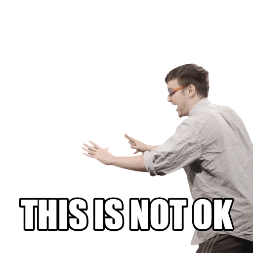
What have we done to deserve this?
|
RamblinRover Luxury-Yacht
> Future Heap Owner
02/07/2019 at 10:59 |
|

 ttyymmnn
> RamblinRover Luxury-Yacht
ttyymmnn
> RamblinRover Luxury-Yacht
02/07/2019 at 11:08 |
|
I can only think that this is all being driven by the mobile experience. Guess what, Kinja: NOT ALL OF US USE A PHONE ALL F**KING DAY! And honestly, I hate reading anything on my phone.
|
RamblinRover Luxury-Yacht
> ttyymmnn
02/07/2019 at 11:14 |
|
This may astound you, but it’s more of a train wreck on mobile. At least on my relatively-small-screened droid phone. The top bar is actually tiled one entry after the next
downwards
, and the like (oh, sorry, “save”) button and replies counter are ambiguous as to which post they’re attached to, with the images and titles in a
muddled
one-after-the-next Charlie Foxtrot.
|
Future Heap Owner
> ttyymmnn
02/07/2019 at 11:14 |
|
I primarily use my phone for Oppo, and I don’t like the new layout on my phone either
|
ttyymmnn
> RamblinRover Luxury-Yacht
02/07/2019 at 11:16 |
|
But what these people fail to understand is that title-under-photo is terrible on a screen that you swipe upward . Y ou are seeing the photo before you know what it is about. They have worked long and hard and come up with a previous format that looked great and worked pretty will. I just wish they would leave it the hell alone.
|
ttyymmnn
> Future Heap Owner
02/07/2019 at 11:16 |
|
So, this is all your fault.
;)
|
RamblinRover Luxury-Yacht
> ttyymmnn
02/07/2019 at 11:25 |
|
If they’re fine with it looking terrible, they should put the title on top of the photo with an outline, the paragraph excerpt below, a separation line,
and put the like/comments buttons on the right of the picture. At least that way it wouldn’t be ambiguous, and they’d have their “BIG THUMBNAIL” dream.
 For Sweden
> ttyymmnn
For Sweden
> ttyymmnn
02/07/2019 at 11:26 |
|
wow square
|
ttyymmnn
> For Sweden
02/07/2019 at 11:31 |
|

 Urambo Tauro
> RamblinRover Luxury-Yacht
Urambo Tauro
> RamblinRover Luxury-Yacht
02/07/2019 at 11:53 |
|

|
RamblinRover Luxury-Yacht
> Urambo Tauro
02/07/2019 at 12:15 |
|